
Slots
Place a feature's own buttons and dropdowns anywhere in your script.
Replace [prefix] with your server's prefix. A slot is where serenity puts a button it has to build itself - the Create Ticket button, the verification button - inside a script you wrote.
What a Slot Is
Some buttons can't be written in an embed script. A link button is just a URL, so {button: ...} can build it - but the Create Ticket button has to actually open a ticket, and the verification button has to actually verify. Those live in serenity, not in your script.
A slot is where serenity puts them. You write a marker, serenity drops its own components in at that exact spot:
// Syntax
$v{slot: name}

// The Create Ticket button, right after the description
{embed}$v{title: Support}$v{description: Press below}$v{slot: ticket}
If a feature only offers one slot, you can write $v{slot} and leave the name out.
You Don't Have To Use One
A slot you never mention is added at the end of the message, exactly like before. Every panel you set up before slots existed keeps working untouched - the marker only matters when you want the button somewhere specific.
Why This Matters for Components V2
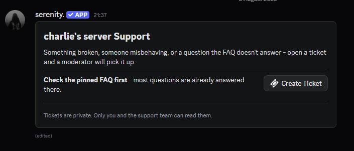
This is the part slots were built for. A Components V2 message is its components: containers, text blocks and rows all the way down. There is no "underneath the embed" to hang a button off, so before slots a feature button and a {components} script could not be combined at all.
With a slot, the button goes inside the container with everything else:
// Create Ticket button inside the container
{components}$v{container: color:#5865F2}$v{text: ### Need help?}$v{text: Pick a topic and we'll be right with you.}$v{separator}$v{slot: ticket}$v{/container}
Next To Text, Instead of Below It
Inside a section, a slot becomes the accessory - the component sitting on the right hand side of the text:
{components}$v{container: color:#5865F2}$v{section: ### Need help?
Open a ticket and a moderator will pick it up. && slot: ticket}$v{/container}
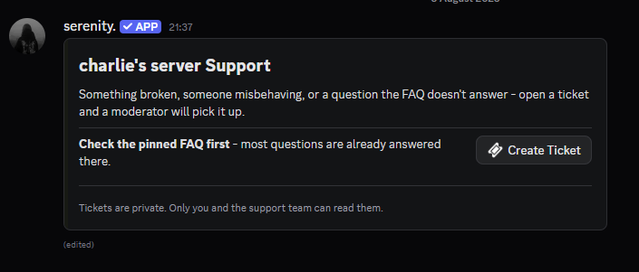
A section holds exactly one accessory, and only a button can be one. If the slot turns out to hold a dropdown instead - a ticket panel switched to dropdown mode, say - it drops to its own row underneath rather than breaking the message.
Available Slots
| Feature | Slot | What lands there | Used in |
|---|---|---|---|
| Tickets | ticket | The Create Ticket button, or the topic dropdown | [prefix]ticket send |
| Tickets | controls | The close, transcript and delete buttons | [prefix]ticket settings opened / [prefix]ticket topic opened |
| Verification | verify | The verify button | [prefix]verification message set |
Rules
- A slot is placed once. Writing
$v{slot: ticket}twice fills the first one and ignores the second. - An unknown slot name is ignored, and the feature's components are appended at the end as usual.
- Slots work in both classic
{embed}scripts and{components}scripts. - In a classic script the slot decides the order of the components; Discord still lays them out in rows itself.
Examples
Ticket panel, Components V2
{components}$v{container: color:#181a14}$v{text: ### {guild.name} Support}$v{text: Tickets are answered within a few hours.}$v{separator}$v{slot: ticket}$v{/container}
Your own link button next to serenity's
A slot and a normal {button} next to each other end up in the same row - unless the slot holds a dropdown, which fills a row on its own.
{components}$v{container: color:#181a14}$v{text: ### Support}$v{slot: ticket}$v{button: label:FAQ && url:https://example.com/faq && style:blue}$v{/container}
In-ticket message with the controls under a divider
{embed}$v{title: Ticket opened}$v{description: A moderator will be with you shortly.}$v{slot: controls}
Last edited